
Samsung Galaxy Ring Review: $399 Smart Health Ring Setup Guide After 11 Months of Daily Wear
June 18, 2025
Audio-Technica ATH-M50xBT2 Review: Do Wireless Monitoring Headphones Finally Deliver Studio-Grade Sound?
June 19, 2025
Finally, Figma has shown its hand — and it is a strong one. At Config 2025, held May 6-8 in San Francisco, the company unveiled a comprehensive suite of Figma AI auto layout features that fundamentally rethink how designers structure, prototype, and hand off their work to developers. If you have ever spent 20 frustrating minutes wrestling with nested Auto Layout frames just to build a simple card grid, or watched a developer rebuild a component from scratch because they could not find the existing one in your design system, this update was made specifically for you.
Figma AI Auto Layout Meets Grid: The End of Nesting Nightmares
The single biggest announcement at Config 2025 was Grid — a brand new 2D auto-layout option that handles rows and columns simultaneously within a single frame. Until now, Figma’s Auto Layout only worked in one direction: horizontal or vertical. Building responsive card layouts, bento box designs, or complex dashboard grids meant stacking Auto Layout frames three or four levels deep — a horizontal frame inside a vertical frame inside another horizontal frame. It was functional, but it was also tedious, error-prone, and a maintenance nightmare for design systems teams.
Grid eliminates that complexity entirely. If you are familiar with CSS Grid, the mental model translates directly. You define your rows and columns, set gap values, and Figma handles the distribution and alignment automatically. Need a layout that shows four columns on desktop, two on tablet, and one on mobile? Grid supports responsive breakpoints natively, meaning you can preview exactly how your layout adapts across device sizes right inside the design tool — no need to export and test in a browser.
According to Figma’s official Config 2025 recap, Grid was designed to close the gap between what designers can envision and what Auto Layout could previously express. The practical impact is substantial. Forrester’s analysis of Config 2025 specifically noted that Grid “eliminates complex nested auto layout workarounds” that have frustrated designers for years. For design systems teams managing component libraries with dozens of layout variants across multiple breakpoints, this single feature could save hours of maintenance work every sprint.
There is also a less obvious benefit: Grid makes design files more readable. When a new team member opens a Figma file, understanding a three-level nested Auto Layout structure takes significant effort. A single Grid frame with clearly defined rows and columns communicates the layout intent immediately. This matters enormously for team scalability and onboarding.

Suggested Auto Layout: AI That Structures Your Designs Automatically
Grid handles the “how” of layout. Suggested Auto Layout tackles the “when” — specifically, the tedious transition point when a designer finishes a freeform visual exploration and needs to convert it into a structured, production-ready component with proper constraints and spacing.
Here is how it works in practice: you select a group of objects on your canvas — maybe a card with an image, title, description, and button that you positioned by eye during an ideation session. Figma’s AI analyzes their spatial relationships — alignment patterns, consistent spacing, visual hierarchy cues — and then automatically wraps them into properly structured Auto Layout frames with appropriate padding, gap values, and alignment settings. Think of it as an intelligent “clean up” button that understands design intent rather than just snapping to a grid.
Some industry observers have noted that this functionality mirrors what certain community plugins have offered for years, and that is a fair point. However, the critical difference lies in native integration. A first-party feature has access to Figma’s rendering engine, component metadata, variant properties, and design token infrastructure in ways that third-party plugins fundamentally cannot match. The result is faster performance, higher accuracy in detecting design patterns, and seamless compatibility with other Figma features like component properties and auto-populated content.
For teams that regularly convert wireframes, mood boards, or exploration files into polished design system components, Suggested Auto Layout could compress what used to be 30-minute manual cleanup sessions into a few seconds of AI-assisted structuring. Across a design team of five or ten people doing this daily, the time savings compounds remarkably fast.
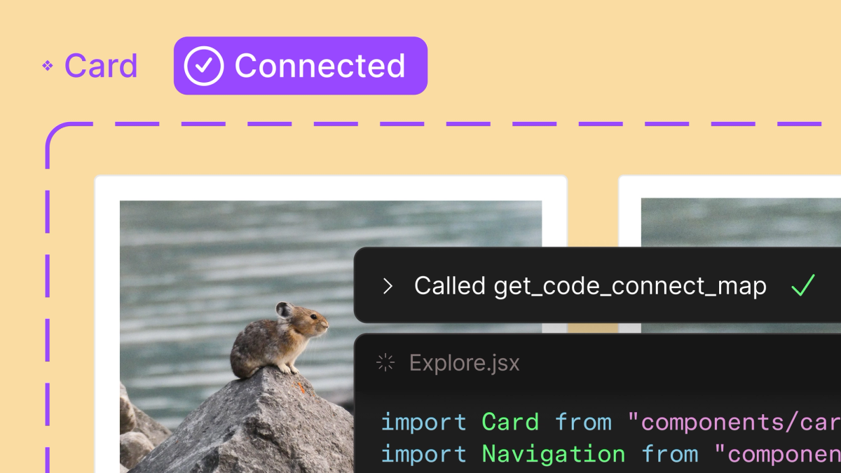
Code Connect and MCP Server: Bridging the Design-Development Gap with AI
The design-development handoff has been a persistent and expensive pain point across the software industry. Designers create components in Figma. Developers rebuild them in code. Over time, the two drift apart. Figma attacked this problem from two complementary angles at Config 2025, and both leverage AI in strategically important ways.
Code Connect UI uses AI to automatically map Figma design components to their corresponding code implementations in your GitHub repository. Select a button component in your design system, and Figma’s AI identifies the matching React, Vue, Angular, or SwiftUI component in your codebase — complete with the correct props, variants, and usage patterns. According to Figma’s official documentation on Code Connect, this creates a live, maintained bridge where design tokens, layout constraints, and component properties flow directly into the development environment without manual synchronization.
The practical implications are significant. Instead of developers independently interpreting a design spec and manually searching for matching components in a large codebase, the AI handles that mapping automatically. This directly addresses the all-too-common “I built it from scratch because I did not know that component already existed” problem that plagues organizations with large component libraries. It also means design token updates — color changes, spacing adjustments, typography tweaks — can propagate to the development side with much less friction.
The MCP (Model Context Protocol) server takes this concept to an entirely different level. It exposes your complete design system — tokens, layout constraints, component structures, usage guidelines, brand rules — as a standardized interface that any AI agent can both read from and write to. This is not a Figma-specific plugin or a proprietary integration. It is an open protocol that enables tools like Claude, Cursor, GitHub Copilot, or any MCP-compatible AI assistant to deeply understand your design system context when generating code, reviewing pull requests, or making design-related decisions.
As Figma’s dedicated MCP blog post explains in detail, this enables powerful scenarios: AI agents auditing design-code inconsistencies and flagging drift, automatically suggesting design token updates when brand guidelines change, generating new components that respect existing patterns, and maintaining visual consistency across AI-generated outputs. For organizations already investing heavily in AI-powered development workflows, the MCP server may be the single most strategically important announcement from the entire Config 2025 event.
Figma Make and the Expanding Design AI Ecosystem
Figma Make is Figma’s entry into the prompt-to-prototype space. Type a natural language description like “e-commerce checkout flow with cart summary sidebar, payment form with credit card and PayPal options, and an order confirmation screen” and Make generates a working, interactive prototype with appropriate components, layout structure, and navigation flow. While prompt-to-UI tools like Vercel’s v0 and Lovable have already established this category, Figma Make differentiates through deep design system integration — the generated prototypes use your team’s existing components and tokens rather than generic UI elements, resulting in outputs that actually look like they belong in your product.
Config 2025 also introduced several other tools that expand Figma’s ecosystem significantly:
- Figma Sites — Publish websites directly from Figma designs, potentially streamlining the design-to-live-site pipeline for marketing pages and landing pages. However, Forrester raised legitimate accessibility concerns in their analysis, noting that design-to-publish workflows may not adequately enforce WCAG compliance standards. This is a substantive issue — if designers can publish directly without accessibility review gates, the web could see a wave of inaccessible sites. Figma needs to address this before broader rollout.
- Figma Buzz — A marketing and brand content creation tool that positions Figma as a direct competitor to Canva for in-house brand teams. It focuses on template-driven, quickly iterable content like social media posts, presentation slides, and marketing collateral.
- Figma Draw — A freeform, pen-based drawing tool designed for early-stage ideation. This fills the “napkin sketch” gap that Figma’s precision-oriented vector tools could never quite address, letting designers brainstorm visually without the constraints of pixel-perfect tools.
Why Design Matters More Than Ever in the AI Era
Forrester’s analysis of Config 2025 offered a thesis that deserves serious attention: as AI increasingly democratizes code generation, design quality becomes the primary competitive differentiator. When virtually anyone — a product manager, a founder, a marketing lead — can prompt an AI to generate functional code, the quality of user experience, visual design, and interaction patterns becomes what separates products that thrive from products that get lost in the noise.
Figma’s entire Config 2025 strategy aligns with this perspective. Every major announcement — Grid for layout architecture, Suggested Auto Layout for intelligent structuring, Code Connect for design-code synchronization, MCP server for AI-accessible design context, Make for rapid prototyping — positions AI firmly as an amplifier for human designers rather than a replacement. The AI handles the mechanical work: structuring layouts, mapping components to code, exposing design tokens to development tools, generating prototype scaffolds from descriptions. But the design decisions themselves — the creative direction, the user experience strategy, the brand identity, the emotional resonance — those remain firmly and necessarily in human hands.
That said, the accessibility concerns around Figma Sites deserve serious and sustained attention from the design community. If Figma is going to offer design-to-publish workflows that bypass traditional development review processes, baking robust accessibility checking into the pipeline is not a nice-to-have — it is an ethical and often legal necessity. The company has until the June 2025 general availability rollout to address Forrester’s concerns, and the design community should absolutely hold them accountable for getting this right.
All of these features begin rolling out in June 2025, and taken together, they represent a genuine paradigm shift for design workflows at every scale. Grid simplifies layout architecture that previously required fragile nested structures. AI-powered Suggested Auto Layout converts freeform explorations into production-ready components in seconds. Code Connect and the MCP server make your design system a living, shared language between human designers and AI development agents. If your team operates a design system, is investing in AI-assisted development pipelines, or simply wants to stay current with where the design tooling industry is headed, now is the time to start evaluating how these capabilities fit into your workflow.
Interested in building AI-powered design system workflows or automating your design-to-development pipeline? Let’s find the right approach for your team.
Get weekly AI, music, and tech trends delivered to your inbox.
